Website Growth
Website UX Mistakes That Reduce Trust and Conversions
Common website experience problems that make visitors hesitate, lose confidence, abandon forms, or fail to take the next step.
By Bibek Thapa · Published Jul 28, 2026 · Updated Aug 10, 2026 · 5 min read
Quick Answer
The biggest UX mistakes are unclear positioning, weak trust signals, slow pages, confusing navigation, hidden pricing or next steps, intrusive popups, poor mobile layout, and forms that ask too much too soon. Fix clarity first, then friction, then persuasion.
Key Takeaways
- Trust drops when visitors cannot quickly understand who the site is for and what to do next.
- Conversion problems often start before the form: unclear copy, weak proof, and poor page flow.
- Mobile UX, page speed, labels, and accessible forms affect both users and organic performance.
- Fix the highest-friction step in the journey before redesigning everything.
Table of Contents
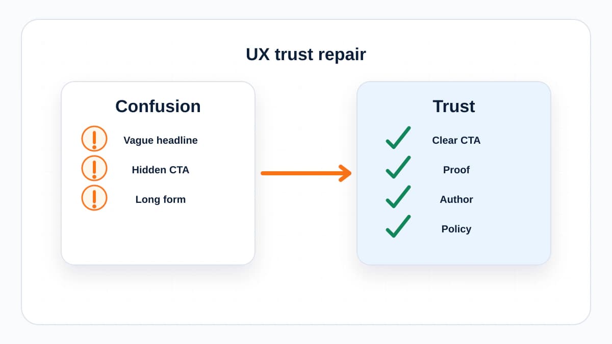
People rarely leave a website for one dramatic reason. They leave because small doubts stack up. The headline is vague. The page is slow. The proof is thin. The form asks for too much. The next step is unclear. None of these feel huge alone, but together they break trust.
The intent behind this article is practical. You want to find the UX mistakes that cost rankings, leads, and sales without rebuilding the whole website first.
1. Vague Positioning
If a visitor cannot explain what you do after five seconds, the page is working too hard against itself. A good homepage or service page should answer who it helps, what problem it solves, and what the visitor should do next.
2. Weak Trust Signals
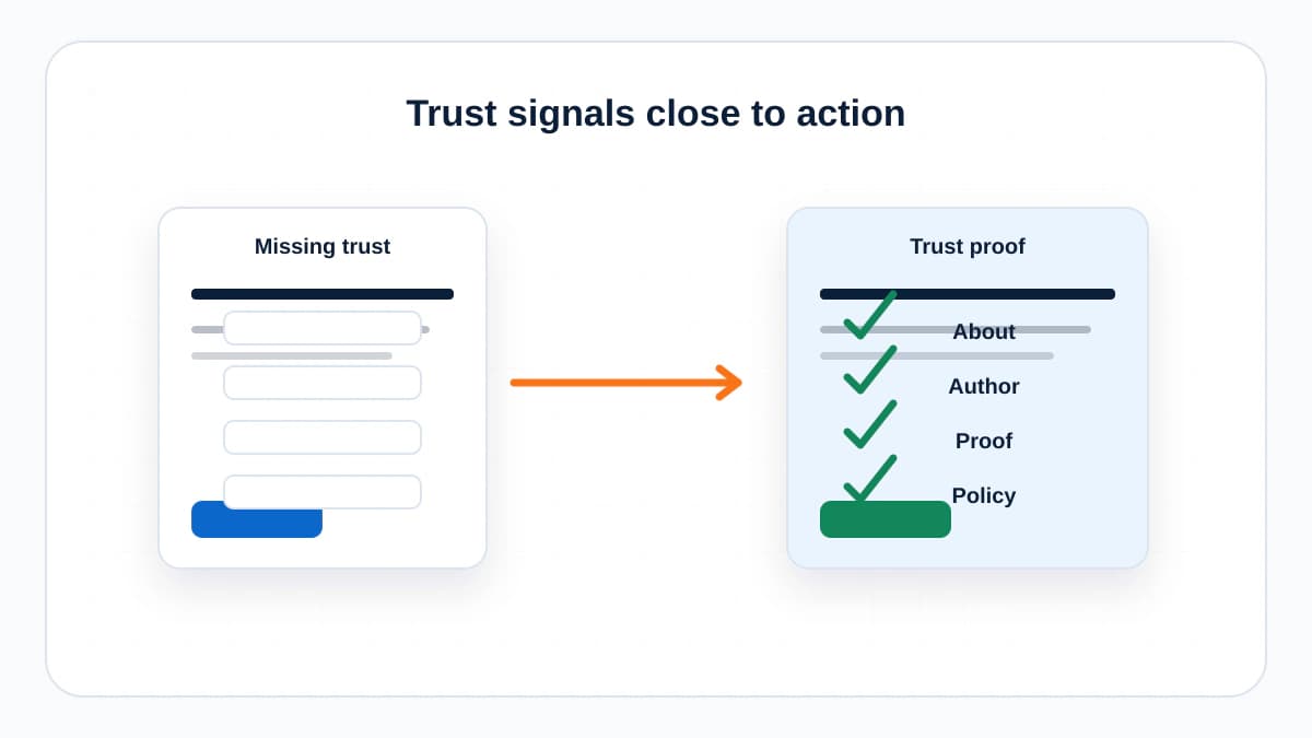
Trust signals do not need to be loud. Clear contact information, an about page, author information, sources, real examples, policies, testimonials, case studies, and recognizable client context all help visitors feel oriented.
3. Slow or Unstable Pages
A slow page makes the brand feel careless before the visitor reads a word. Layout shifts are even worse because they interrupt action. Page experience is not only an SEO topic; it is a confidence topic.
4. Navigation That Reflects the Company, Not the User
Navigation should match how visitors think. If the menu is organized around internal departments, cute labels, or vague categories, people have to translate before they can move. Use labels that describe the destination.
5. Hiding the Next Step
Every important page should have a next step. Read a guide, compare tools, contact the team, download a checklist, subscribe, or view a related service. When there is no next step, interested visitors drift.
6. Forms With Too Much Friction
Long forms are not always bad, but early forms should earn each field. Ask only for what you need at that stage. Label fields clearly, explain required formats, and show what happens after submission.
7. Mobile Layout Afterthoughts
Many websites are approved on desktop and experienced on mobile. Check tap targets, sticky headers, form fields, image cropping, card spacing, and whether the first screen communicates enough before the user scrolls.
8. Popups That Interrupt the Promise
A popup that appears before the visitor understands the page is a tax on attention. Use overlays carefully, especially on mobile. If the popup blocks the main content or creates frustration, it is probably hurting more than helping.
9. Generic Proof
Visitors are skeptical of vague claims like trusted by businesses or results-driven strategies. Strong proof is specific: numbers with context, before-and-after examples, screenshots, named processes, or clear explanations of how results were achieved.
A Fix Order That Works
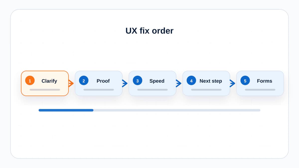
- Clarify the page headline and first paragraph.
- Add trust signals near the decision point.
- Make the primary CTA visible and specific.
- Simplify forms and label every field.
- Check mobile manually.
- Fix speed and layout shift issues on top landing pages.
- Use analytics to find the step where visitors drop.
The Bottom Line
Good UX is not decoration. It is the path between interest and action. Fix clarity, reduce friction, show proof, and make the next step easy. That is where trust and conversions usually improve first.
Frequently Asked Questions
What is the most common website UX mistake?
The most common mistake is unclear positioning. Visitors should quickly understand what the site offers, who it is for, and what step to take next.
Can UX affect SEO?
Yes. Google recommends providing a good page experience, and better UX can also improve engagement, conversions, and internal navigation.
How do I find UX problems on my site?
Review analytics, watch session recordings if available, test mobile pages manually, inspect forms, and ask new visitors what they think the page is offering.
Sources and References

Written by
Bibek Thapa
AI-Powered Digital Growth Strategist
Bibek Thapa works across AI workflows, SEO, AI search optimization, content strategy, website growth, and productivity systems. Anobee documents practical lessons, tools, experiments, and systems for improving digital presence.
- AI workflows
- Digital growth
- SEO
- GEO
- AEO
- Content strategy
- Website growth