
Website Growth
Creating a Services Page That Converts: The Eight Decisions, and a Real Audit of Ours
By Bibek Thapa · Updated · 12 min read
Quick Answer
A services page converts when it answers three questions fast: what you do, who it is for, and what happens if I get in touch. Put the outcome and the audience in the headline, describe services by the problem they solve, place proof where doubt appears, and keep the form short. Then measure where people stop: on Anobee's own site, 20 people started a form in 90 days and 8 finished it.
Table of ContentsOn this page
- The three questions every services page has to answer
- Decision 1: What the services page headline promises
- Decision 2: How the services are described
- Decision 3: Where the proof goes
- Decision 4: What happens next
- Decision 5: How much friction the form carries
- Decision 6: Where the calls to action sit
- Decision 7: Whether the page says anything about price
- Decision 8: What you measure on a services page
- An honest audit of Anobee's own page
- Common services page mistakes
- The services page checklist
- Bottom line on creating a services page that converts
- Frequently Asked Questions
- Sources and References
Key Takeaways
- Readers skim: Nielsen Norman Group estimates users read at most 28% of the words on an average page, and 20% is likelier.
- Anobee's own 90 days: 20 users started a form, 8 submitted one. Three in five abandoned after starting.
- Only 5 users triggered the contact event in that period, from 999 users. The form is the bottleneck, not the traffic.
- Name the audience and the outcome in the headline. "Services" is a category; a promise is what gets read.
- Put proof where the doubt is, next to price and process, not stacked in a logo strip nobody reads.
- Track form starts separately from submissions. Without both, an abandoned form looks identical to no interest.
Most advice about creating a services page is written as if the reader will study it. They will not. Nielsen Norman Group's analysis of 45,237 page views concluded that "on the average Web page, users have time to read at most 28% of the words during an average visit; 20% is more likely" [1]. Earlier eyetracking across 232 users found reading follows an F-shaped pattern, and that "users won't read your text thoroughly in a word-by-word manner", especially when "conducting their initial research to compile a shortlist of vendors" [2].
That is the constraint this refresh is built around. Consequently, the second half of the article is an audit rather than more advice. Anobee's own contact page is its services page, and over the 90 days to 26 September 2026 it produced 5 contact events from 999 users, with 20 people starting a form and 8 submitting one.

Meanwhile, the previous version of this page carried two unresolved internal-link placeholders and two headings with missing tables underneath them. It also carried an unsourced "over 60% of services page traffic now arrives on mobile", an unsourced "2-5%" conversion benchmark, several "consistently generate higher inquiry rates" claims with nothing behind them, and a wrong definition of GA4 engaged sessions. All of that is fixed or gone.
The three questions every services page has to answer
A visitor arrives already mildly interested. Either they searched for something, or somebody sent them. In the seconds before they decide whether to keep reading, they are working out three things:
- Do they do the thing I need?
- Have they done it for someone like me?
- What happens if I get in touch?
Everything below is in service of answering those in that order, fast enough to survive a skim.
Decision 1: What the services page headline promises
The headline is the only part you can rely on being read. Therefore spend it on the outcome and the audience, not on your job title.
- Category: "Web design services"
- Promise: "Websites for small clinics that book appointments without a phone call"
The second one loses every visitor who is not a clinic, which is the point. Meanwhile, a services page that tries to be for everyone reads as being for nobody, and the people it does fit cannot tell.
Underneath, one line that removes the largest objection before it forms: no long contracts, fixed price, work starts in two weeks, whatever is true for you.
Decision 2: How the services are described
Describe each service by the problem it removes, then say what it produces. Two sentences each is usually enough at the top of the page. Meanwhile, detail can live further down for the minority who read on.
A structure that survives a skim:
| Element | Weak | Better |
|---|---|---|
| Name | "SEO Package" | "Search visibility audit" |
| Problem | (absent) | "You rank for your brand and nothing else" |
| Deliverable | "Comprehensive optimisation" | "A prioritised list of fixes, with the three biggest done for you" |
| Shape | "Contact for details" | "Two weeks, fixed fee, one call at the start and one at the end" |
Adjectives do no work here. "Professional", "experienced" and "high-quality" are claims every competing page also makes. Consequently they carry no information.
Decision 3: Where the proof goes
Proof works where the doubt is, not where the layout has room. However, a testimonial in the hero is seen by everyone and persuades nobody, because no question has formed yet.
Place it deliberately:
- Beside a claim about outcomes, a client result that supports that specific claim.
- Beside the price, the piece that addresses whether it is worth it.
- Alongside the process, something that says it actually runs as described.
- At the form, the reassurance about what happens after sending.
If you are early and have no client proof, say so and substitute what you do have: published work, a documented method, a clear refund or exit policy. Ultimately, an honest absence reads better than a vague implication.
Decision 4: What happens next
This is the question most services pages leave unanswered, and it is also the cheapest to fix. Write the steps down: you send a message, I reply within N working days, we have a call of N minutes, you get a proposal or a no.
A person deciding whether to type their email address is really deciding whether they are about to be sold to for a month. Therefore telling them exactly what happens removes the risk, and costs you three sentences.
Decision 5: How much friction the form carries
Every field is a chance to stop. That is not a slogan here. Instead, it is what the numbers say.
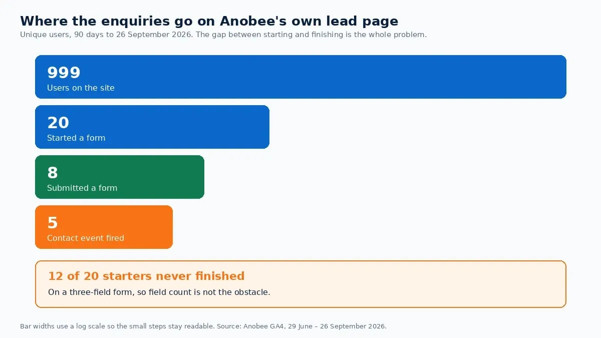
Over the 90 days to 26 September 2026, across 999 users, Anobee's analytics recorded 42 form_start events from 20 users and 29 form_submit events from 8 users. Twelve of the twenty people who began filling in a form never finished. The contact and submit_lead_form events each fired for 5 users.
Two things follow. First, the traffic is not the bottleneck at this size; the form is. Second, a site that only tracks submissions would see 8 people and conclude nobody was interested, when in fact 20 started.
Practical rules: ask only for what you need to reply usefully, put the fields in the order a person would say them aloud, never make a phone number required, and say what you will do with the data next to the button rather than in a policy link.
Decision 6: Where the calls to action sit
Use one action, repeated where it becomes relevant. Here is the usual working placement, top to bottom:
| Position | What it is for |
|---|---|
| Above the fold | The visitor who already knows they want this |
| After the service descriptions | The visitor who just found the thing they needed |
| After the proof section | The visitor whose doubt was just answered |
| After pricing | The visitor who has done the arithmetic |
| End of page | The thorough reader who reached the bottom |
Keep the wording identical each time and specific: "Send a project brief" or "Book a 20-minute call", never "Submit". Otherwise competing CTAs split intent, where one CTA repeated collects it.
Decision 7: Whether the page says anything about price
Say something. A starting figure, a typical range, a worked example, or the variables that drive the number all work. Otherwise the page asks the visitor to guess, and the cautious ones guess high and leave without telling you.
If your work genuinely varies, name the drivers: scope, timeline, how much is already in place. Consequently an unknown becomes a question they can answer themselves.
Decision 8: What you measure on a services page
You cannot fix a page you cannot see into. Here is the minimum set:
- CTA clicks, so you know whether anyone reached the ask.
- Form starts, separately from submissions. Without this pair, abandonment is invisible.
- Form submissions, as a key event.
- Scroll depth, to learn whether the CTA is below the point where people stop.
- The same numbers split by device, because layout problems are device-specific.
One definition to get right, since the previous version of this page had it wrong: in GA4 an engaged session is one that "lasts longer than 10 seconds", "has a key event", or "has 2 or more screen or page views", and bounce rate is the inverse of engagement rate [3]. It is not 30 seconds, and it is not a satisfaction score. The bounce rate guide covers why that metric answers less than people assume.
The conversion rate optimization guide covers what to do with the numbers once they exist, including the awkward fact that a site this size cannot A/B test its way to an answer.
An honest audit of Anobee's own page
Anobee has no separate services page, so its contact page does that job. Here is how it scores against the eight decisions above, on 27 September 2026.
| Decision | What the page does | Verdict |
|---|---|---|
| 1. Headline | "Let's Talk About Digital Growth" names the area but no audience or outcome | Weak |
| 2. Service descriptions | Five topics listed: AI workflows, content strategy, SEO/GEO/AEO, website growth, productivity | Partial. Topics, not problems |
| 3. Proof | "Top rated on Upwork, 100% job success" appears near the top | Present, but placed away from the doubt |
| 4. What happens next | "We usually reply within a few working days" | Good, and rare |
| 5. Form friction | Three fields: name, email, message | Good |
| 6. CTA | One form, one direct email address | Good |
| 7. Price signal | None | Missing |
| 8. Measurement | form_start, form_submit, contact and submit_lead_form all tracked | Good |
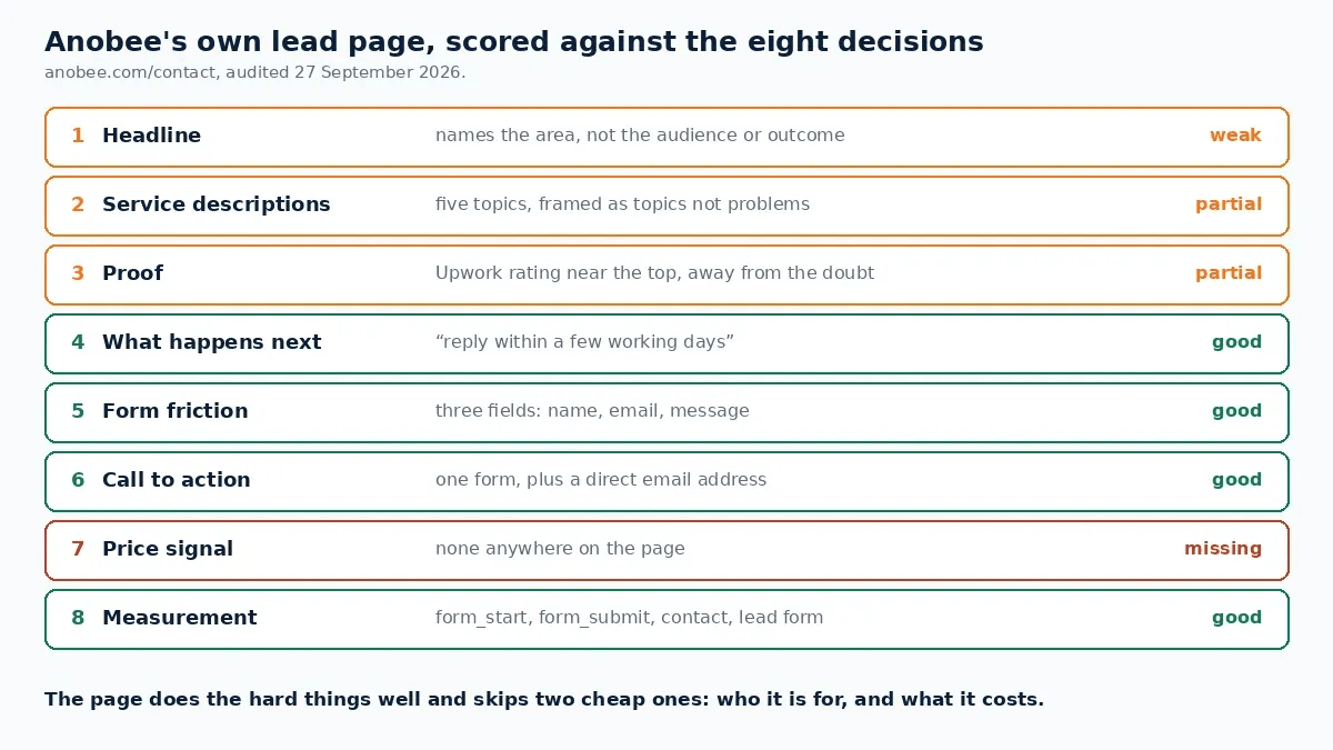
The unusual part of that table is that the page does the hard things well, the short form and the stated reply time, and skips two cheap ones: a headline that names who it is for, and any indication of price. Moreover, it has an inquiry checklist telling visitors what to prepare, which is a genuinely good idea most services pages do not have.
The abandonment numbers sit against that backdrop. Twelve of twenty starters not finishing, on a three-field form, suggests the hesitation is not field count. Instead, it is more likely the unanswered question the audit exposes: no price signal, and a headline that does not tell a visitor whether they are the right kind of person to be writing in.
Common services page mistakes
- Writing for the scroll you wish people did. They read about a fifth of it [1].
- A headline that names the category rather than the buyer.
- Proof stacked at the top, far from the claims it should support.
- Leaving "what happens next" unsaid, which readers fill in with "sales call".
- Long forms, or a required phone number.
- No price signal at all, which makes the cautious visitor invent one.
- Tracking only submissions, so abandonment looks like disinterest.
- Ignoring the mobile view. Page experience is device-specific, and Google's own guidance treats mobile rendering as part of it [4].
The services page checklist
Above the fold
Body
Form
Measurement
Bottom line on creating a services page that converts
A services page is not a brochure; it is an answer to three questions asked in a hurry. Name who it is for and what they get, describe the work by the problem it removes, put proof where the doubt appears, say what happens after someone writes in, and keep the form short. Then instrument it well enough to see where people stop. Ultimately, the difference between "nobody is interested" and "twelve people started typing and gave up" is the whole diagnosis, and on this site it was the second one.
Frequently Asked Questions
What should a services page include?
A headline naming the outcome and the audience, a short description of each service framed by the problem it solves, proof placed next to the claims it supports, a clear statement of what happens after someone gets in touch, pricing or a price range if you can give one, and a single short form. Everything else is optional.
How long should a services page be?
Long enough to answer the questions a buyer has before they can act, and no longer. Nielsen Norman Group's research suggests visitors read about a fifth of the words on a page, so extra length mostly adds scrolling. Write for a skim first, then let the detail sit lower down for the few who read everything.
Should a services page show prices?
Show something if you can: a starting figure, a typical range, or a worked example. A page with no price signal makes the visitor guess, and the cautious ones guess high and leave. If prices genuinely vary, say what drives the variation and give the range it usually falls in.
How many fields should a contact form have?
As few as you can defend. Every field is a chance to abandon, and Anobee's own analytics show 20 form starts producing 8 submissions over 90 days. Ask for what you need to reply usefully, and gather the rest in the conversation that follows.
How do you measure whether a services page converts?
Track the form start and the form submission as separate events, plus the CTA click. The gap between starts and submissions tells you whether the page or the form is the problem. Add scroll depth to see whether visitors ever reach the CTA, and check the mobile numbers separately.
Sources and References
Was this guide helpful?
Your answer helps Anobee improve future updates.

Written by
Bibek Thapa
AI-Powered Digital Growth Strategist
Bibek Thapa works across AI workflows, SEO, AI search optimization, content strategy, website growth, and productivity systems. Anobee documents practical lessons, tools, experiments, and systems for improving digital presence.
- AI workflows
- Digital growth
- SEO
- GEO
- AEO
- Content strategy
- Website growth


